Exercise: Interpretive Processing
Make three different versions of the same image, together with a written explanation of what you were trying to achieve, and an assessment of how well you think you succeeded.
Interpretive processing effects have a multitude of uses in advertising and film. Without the ability to change the appearance of an image easily and with known effects, and a lot of unknown before, advertising houses would need to resort to a great deal of mock-up manufacture to be able to capture the effect they want. Prior to desktop processing this sort of work was done by hand by very skilled artists, since the advent of software like Photoshop there as arisen a new breed of rendering artist who previously did the work by hand with pens, brushes, inks and paints.
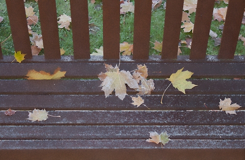
Image 1: is as, straight from the memory card and the only thing that I’ve done is create a .jpeg image of it to post here in this log.
Image 2: I determined that the image was correct as far as highlight and lowlight clipping was concerned and I was also happy with the brightness and contrast, so the only usual manipulation I had to do was to create a new layer, rotate it slightly, crop the result and sharpen the image.
I’ve always been taken with the image of the ‘The Little Girl In The Red Coat’ from the movie ‘Schindler’s List’. This is the only colour image in the whole movie and as a result stands out against the rest of the black & white scenes.
I didn’t want to create an exact copy of something that looks similar to ‘colour popping’, but something that was in a similar vein without causing a dramatic change to the way the image appeared; something I hope that’s a little more subtle but powerful none-the-less.
Image 3: Since starting this course I’ve found the need to look at other art forms besides photography, and I watched a television programme about ‘The Impressionists’ which made me an ardent fan of the style and image effect they generated. To reproduce that kind of effect with a camera isn’t possible, as they used paints and canvas and their own hands and eyes to judge line and colour, whereas the camera makes an exact representation of whatever is put in front of it, machine-made lines in other words. Therefore to ‘imitate’ the same effect requires the photographic image to be manipulated in some way.
In this case I used a filter that gave a sponge effect to the surface and then I added surface blur until I thought I had a very near representation.
Image 4: I personally like a lot of black and white infrared images as they seem a lot more subtle in the way they handle translucent items, like the leaves in this image. Straight black & white always seems to be very all-on or all-off with regard to translucency, whereas infrared seems to show the light coming through the item in a less harsh manner.
All I did here was use the black and white filter effects and choose infrared.
Assessment
Of the three interpretations, the only one I had any real artistic input to was Image 2: where I had to experiment with where the colour highlight was going to go and what colours I’d use. Of the other two, Image 3: required more input than Image 4: but only inasmuch as I had to decide which filters to use and the degree of effect to apply. Image 4: was a single step selection of a filter and as a result only needed me to think about how I liked images to appear to me.
So, of the 3 I’m most pleased with Image 3: funnily enough, because I think I’ve come very close to an Impressionist painterly effect.


